Decorating with Gray
There’s been a sea change in the design world over the last few years when it comes to neutrals. Taupes, khakis, and other forms of beige have fallen to the wayside in favor of a new favorite tone: gray. With the calmness of a blue, warmth of a tan, and subtlety of a cream, gray is a versatile color that works well in both traditional spaces and über-modern ones, and is as useful as the backdrop to an eclectically outfitted home as it is the base for a minimal one. But with infinite shades to choose from, it can be hard to find the right hue. AD asked three designers for their top dos and don’ts when it comes to using gray.
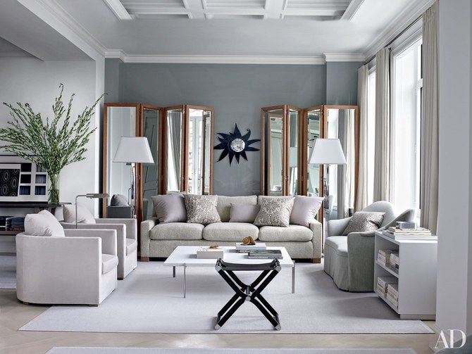
Do: Consider Tone “Not all grays are alike,” says Young Huh, the founder and principal of New York–based Young Huh Interiors. “There are warm grays and there are cool grays, and in general it’s best to keep all colors in one of those two tonal lanes.” Don’t bog down a crisp gray with creamy whites, she warns: “If you’re painting a wall a cool blue gray, it’s best if you paint the trim a cool gray white. Warmer whites will make the room look dingy.”
Do: Work With Light “When you decide to paint a room or decorate with gray, consider the kind of lighting the room gets,” Huh says. “A sunny room may look best with a strong warm gray, while a northern-facing room with blue light may look best with a subtle cool gray.”
Don’t: Veer Pink “It’s important to pick gray paint that doesn’t have any pink or purple undertones,” advises California-based designer Becki Owens. “You’d be surprised at the impact those subtle undertones will have on a space. They don’t work well as neutrals. You want colors that create a classic, soothing palette on which you can then build and layer the rest of your design.”
Do: Choose Blues “When selecting gray paint, I like to pick colors with warm or blue undertones,” Owens says. “A couple of my favorite gray paint colors are Anew Gray by Sherwin Williams at 25 percent strength for a light fresh look or Bunny Gray by Benjamin Moore for cool undertones.”
Do: Test the Temperature Michigan-based designer Corey Damen Jenkins considers temperature before all else. “There are blue grays, brown grays, cool grays, and warm grays. The wrong temperature can throw off an entire space’s palette ” he says.
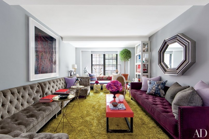
Don’t: Steer Away from the Bold For Jenkins, gray is an ideal neutral to serve as a complement to richer hues. “Don’t be afraid to mix jewel tones with gray, he says. “It can play a variety of supporting roles with many vibrant colors.”
(Content courtesy of Architectural Digest)